Design systems push for universal standardization and over time design patterns emerge leading to users adopting behaviors as if they are second nature. Some of these design patterns however, are either counterintuitive, outdated or flat out bad.
This article explores popular universal design patterns that are problematic and how we can fix them to design more inclusive and accessible experiences for all.
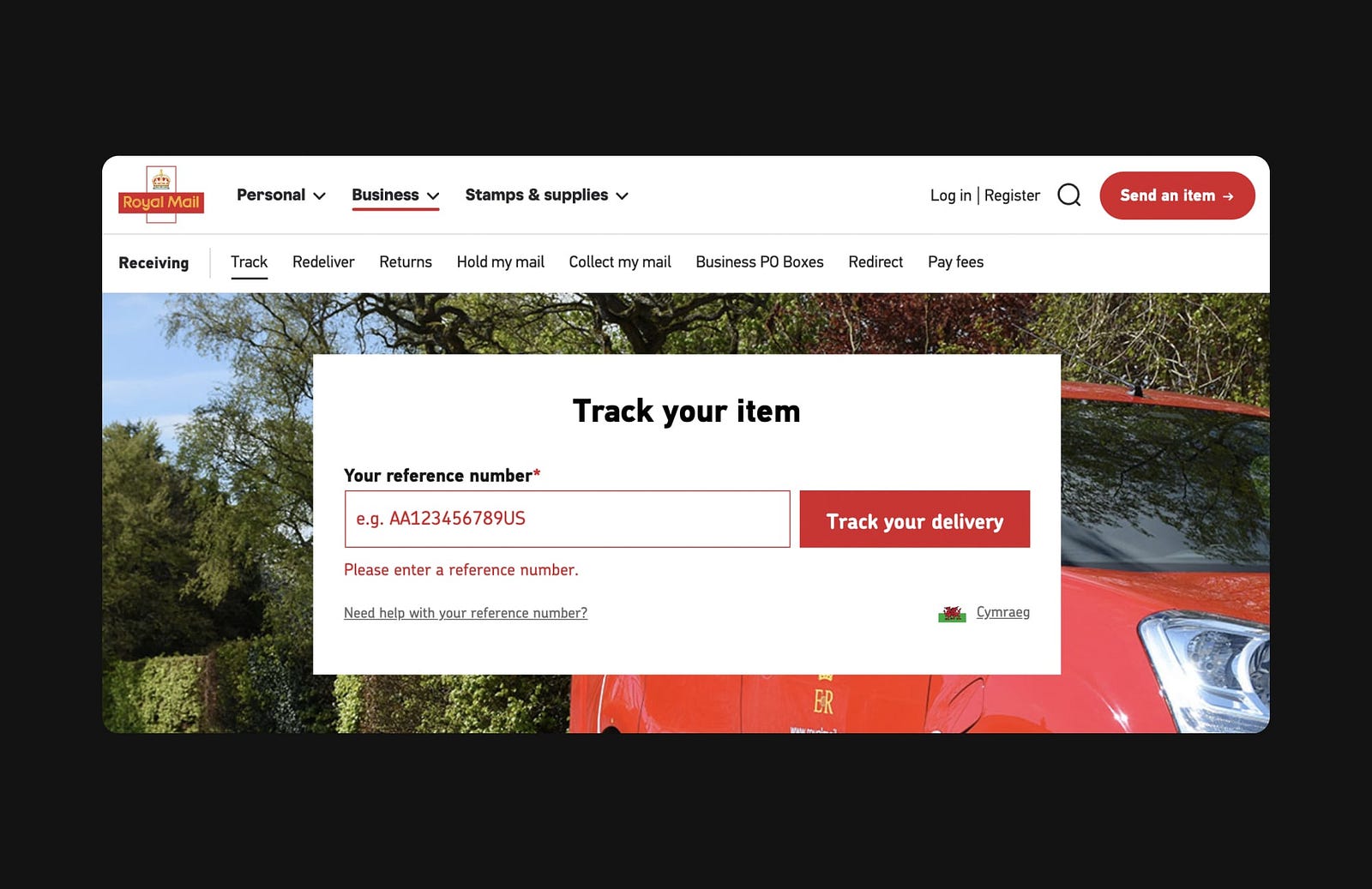
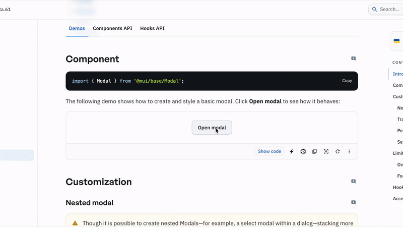
Signified Buttons
The real intent is hidden behind the button.
Buttons are the foundational building blocks of any design system. However, they can sometimes have ulterior motives.
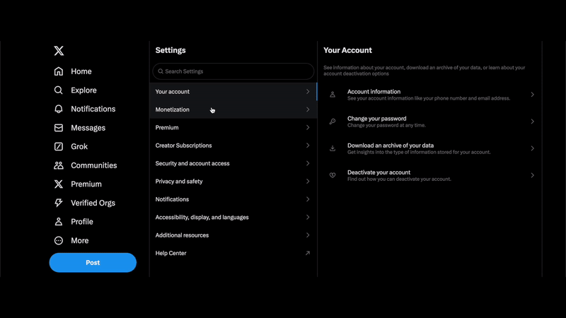
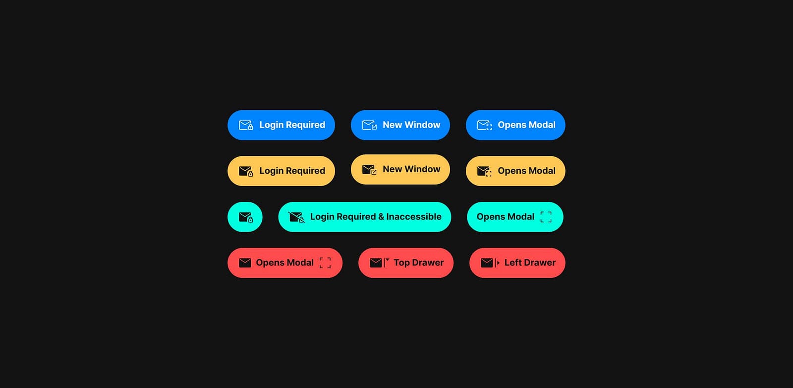
Adding an icon to a button can signify its purpose, but does it truly convey intent? How often have you clicked a button within a list only to find your experience interrupted by a new window or an unsuspecting login modal? This design pattern can feel even more alienating when the animation is quick and subtle, leaving you wondering why the back button is disabled. The example shown for the X app highlights the poor practice of mismanaging user expectations.
A select button typically implies that a list of options will appear in a specific direction, indicated by a prepended arrow — so why don’t we apply similar indicators to buttons that open modals, animate into view, or launch new windows?

Ideally we should avoid this pattern, however, there are instances where this practice is justified. Just as a dropdown arrow signifies a menu, perhaps we could add another icon to indicate intent, helping users better anticipate outcomes. Apple’s Human Interface Guidelines, for instance, suggests adding a trailing ellipsis to buttons on mobile when they open a window, view, or app.² Could we adopt a similar convention for all types of transitions? Alternatively, could we create better visual cues by using distinctive button styles for actions that deviate from the norm?
Potential Solution
Traffic Light Color Roles
Ready. Set. Go! When system colors clash with brand, culture and biology.
In accessibility, we’re taught to avoid relying solely on color as a signifier. So why do design systems continue to use a traffic light system to convey system status by default, when we could also incorporate icons, text, and motion?
System colors like green for success, yellow for warnings, and red for errors can clash with branding — especially when a brand’s primary color resembles that of a system error. Cultural sensitivities also play a role: in Western cultures, red is commonly associated with errors and warnings, while in Eastern cultures, red symbolizes good luck and positivity. Additionally, why are notification badges (bubbles) almost always red? It turns out that red is the brightest color the human eye can detect, which is useful in the attention economy.
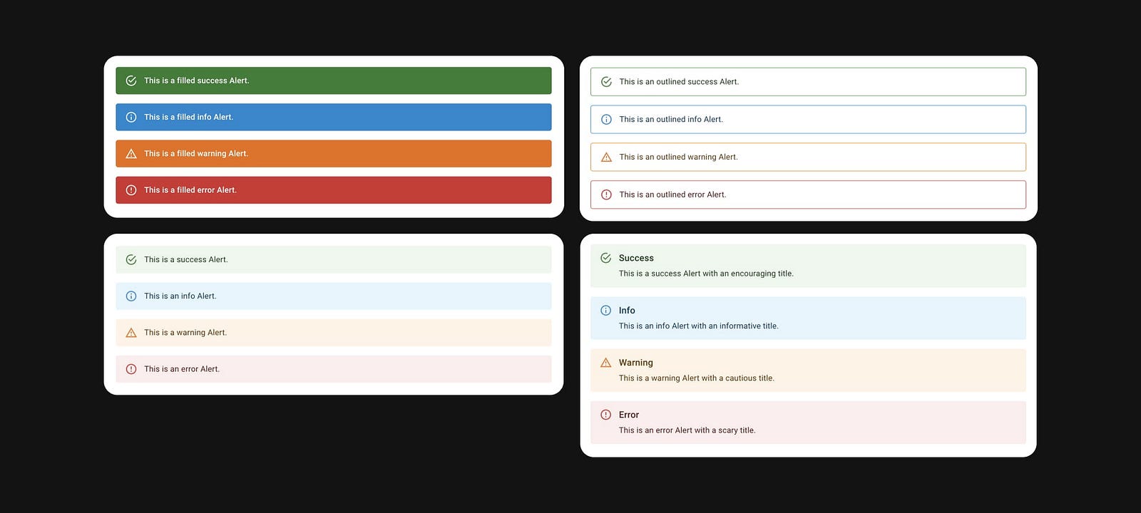
Of course, there’s a biological reason for associating red with danger and errors — our ancestors linked the color to poison. But evolution isn’t perfect: other colors in nature, such as the green of cobras or the yellow of certain frogs, also signify danger. Construction workers wear high-visibility clothing in various colors, most often yellow or green. Do we really need to signal dangerous error states for our users?
Users with color vision deficiencies don’t rely on color alone and still navigate interfaces successfully. Colorblind drivers manage traffic lights without relying on color distinctions. Plus, dark mode often inverts colors, shifting the visual emphasis. If color alone isn’t essential for these contexts, we too can move away from it.
Potential Solution

As designers, we can adapt system status indicators to colors that contrast with branding and minimally clash with the dominant cultures while also leveraging icons, motion, text, and visual hierarchy for enhanced inclusivity.
Star Rating Inflation
“If I could give this product zero stars I would!”
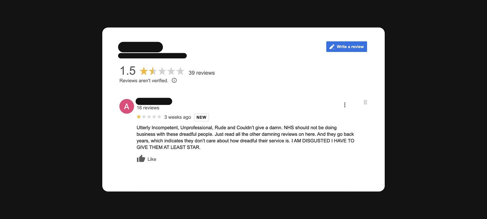
How many times have you read a review on a platform like Google Maps from a frustrated consumer (or felt that frustration yourself) due to the lack of a “no stars” option for a terrible experience?
The disconnect between the rating system’s functionality and the reviewer’s mental model often stems from extreme dissatisfaction and the inability to express this through the interface. This results in the frustration of being forced to select at least one star, which can inflate the overall rating.
Furthermore, a star rating can be open to multiple interpretations by the reviewer. Does it convey the quality of the product, the reviewer’s experience, the brand’s reputation, or all of these?
The rigid, one-dimensional star rating system is based on the psychometric 5-point Likert scale, where responses range from strong agreement to strong disagreement. Allowing a zero-star option would likely disrupt this established interaction pattern.
Potential Solution
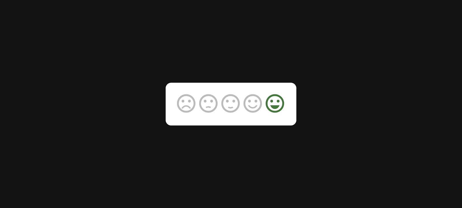
As emotional beings, we express our feelings in varied ways. Moving beyond a single rating by breaking down different aspects of the experience into categories and enabling reviewers to convey emotions through icons or text could help bridge the gap between the rating experience and the reviewer’s mental model and enhance inclusivity.
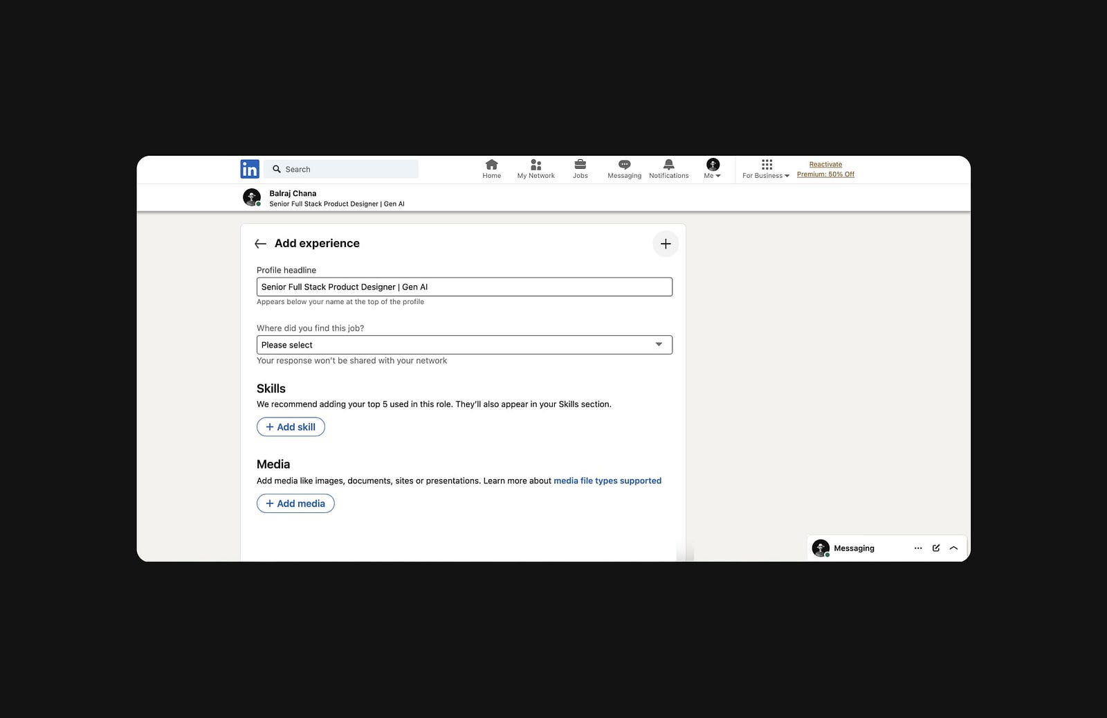
Stacking Modals
Modal over modal overload.
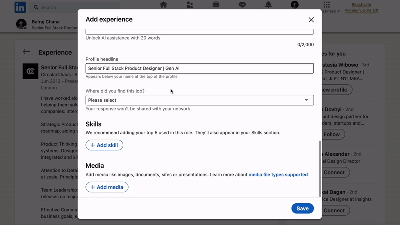
Modals are perhaps one of the most overused and misused components in design systems. Originally intended to display critical information, modals are now frequently used as an anti-pattern for showing ads, surveys, and shortcuts like editable states that disrupt the user’s primary workflow.³
What’s worse than a non-critical modal? A non-critical modal on top of another non-critical modal. This “modal inception” breaks navigation, pulls the user further out of context, adds visual clutter, increases cognitive load, and introduces accessibility issues.
This interaction pattern from LinkedIn is an example of poor design, but fortunately, there are better alternatives — even if they may require more advanced technical implementation. Extra engineering work should never be an excuse to compromise usability.
Potential Solution
Alternative solutions including drawers, steppers, or even a separate page would be a significant improvement.
Radio Button Resets
Unconscious priming.
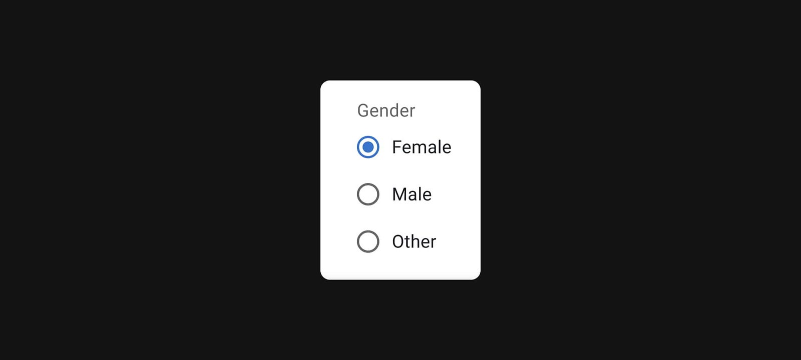
We’re all familiar with radio buttons: they belong to a group where only one option can be selected at a time, like choosing a gender in a form.
Traditionally, radio button groups display a preselected option by default. At first glance, this might seem harmless. However, in contexts like surveys, this design introduces unintended bias. In choice architecture, the concept of priming subtly influences users to choose the default option without consciously considering alternatives. In surveys or research, this can lead to skewed data.
An alternative pattern is to display all radio buttons as deselected initially. However, this brings its own issues. Unlike checkboxes, radio buttons don’t allow users to revert to a non-selected state once an option is chosen. This can be frustrating, particularly in surveys or optional fields, where the inability to undo a selection can disrupt usability.
Good design should anticipate and allow for user errors. In a lengthy survey, for instance, an accidental click on a radio button shouldn’t be irreversible.
Potential Solution

To address these usability issues, adding a reset button for radio groups provides a simple way for users to undo selections and restore the initial state.
Unnatural Colors
Throwing some shade.
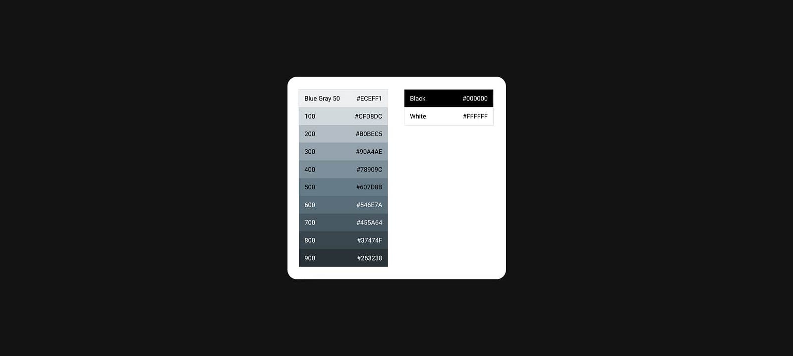
Pure white is often the default background color for many apps, while brands like Uber and X opt for boldness by using pure black as a primary brand color.
Interestingly, pure white (#FFF) and pure black (#000) are almost nonexistent in nature, making them feel harsh and unnatural to users.⁴ Their extreme contrast can lead to eye fatigue and strain due to their intense, glaring quality.
Potential Solution

To reduce these effects and create a more comfortable user experience, consider using warmer, muted shades rather than pure black or white — except in cases where high-contrast accessibility is essential.⁵
Static Motion
Slowing down time.
Unless you’re watching a horror movie, objects don’t typically appear out of nowhere. Similar to harsh colors, abrupt or unnatural motion in interfaces — such as instant modal pop-ups, reactive widgets, or rapid page transitions — can disrupt visual continuity, confuse users about loading states, and increase cognitive load.
Animated transitions are increasingly important for usability, especially with the rise of reactive applications, yet they’re rarely integrated into design systems by default.⁶
As humans, we’re wired to respond better to gradual environmental changes; sudden shifts can even trigger a sense of alert or threat.⁷ This instinct applies to digital interfaces as well.
Potential Solution
By providing smooth, gradual transitions, we guide users with predictable, intuitive cues that make navigation and interaction more seamless and satisfying.
Pointy Curves
How dangerous can a snake be?

Curved edges are everywhere — on iPhones, app icons, avatars, buttons, and nearly every design component in the products we use daily. This design choice, however, isn’t purely aesthetic.⁸
There’s an evolutionary reason for our subconscious preference for curved edges over sharp ones. Sharp edges, like those on knives, can trigger mild anxiety by activating the amygdala, as they’re perceived as potentially threatening. In contrast, soft curves are associated with safety, calmness, and warmth.⁹ This instinctive response extends to digital interfaces as well.
Potential Solution
By opting for curved edges in design components, we can foster a more welcoming experience that elicits positive emotions and reduces user anxiety.
References
- Experience, W.L. in R.-B.U. (n.d.). Opening Links in New Browser Windows and Tabs. [online] Nielsen Norman Group. Available at: https://www.nngroup.com/articles/new-browser-windows-and-tabs/.
- Apple Developer Documentation. (2024). Buttons | Apple Developer Documentation. [online] Available at: https://developer.apple.com/design/human-interface-guidelines/buttons#Push-buttons.
- Experience, W.L. in R.-B.U. (2017). Modal & Nonmodal Dialogs: When (& When Not) to Use Them. [online] Nielsen Norman Group. Available at: https://www.nngroup.com/articles/modal-nonmodal-dialog/.
- Aleman, A.C., Wang, M. and Schaeffel, F. (2018). Reading and Myopia: Contrast Polarity Matters. Scientific Reports, 8(1). doi:https://doi.org/10.1038/s41598-018-28904-x.
- Gorn, G. J., Chattopadhyay, A., Yi, T., & Dahl, D. W. (1997). “Effects of Color as an Executional Cue in Advertising: They’re in the Shade.” In Management Science.
- Ng, A., & Brewster, S. (2020). “Animation in Mobile User Interfaces: The Role of Timing and Placement.” In ACM Transactions on Computer-Human Interaction.
- Miller, G. A., & O’Leary, D. (1965). “The Perception of Time in a Rapidly Changing Environment.” In Journal of Experimental Psychology.
- Bar, M. and Neta, M. (2006). Humans Prefer Curved Visual Objects. Psychological Science, 17(8), pp.645–648. doi:https://doi.org/10.1111/j.1467-9280.2006.01759.x.
- Bar, M. and Neta, M. (2007). Visual elements of subjective preference modulate amygdala activation. Neuropsychologia, 45(10), pp.2191–2200. doi:https://doi.org/10.1016/j.neuropsychologia.2007.03.008.
Leave a Reply